Friday 30 January 2015

Narrative Map - Safwana and Yagmur


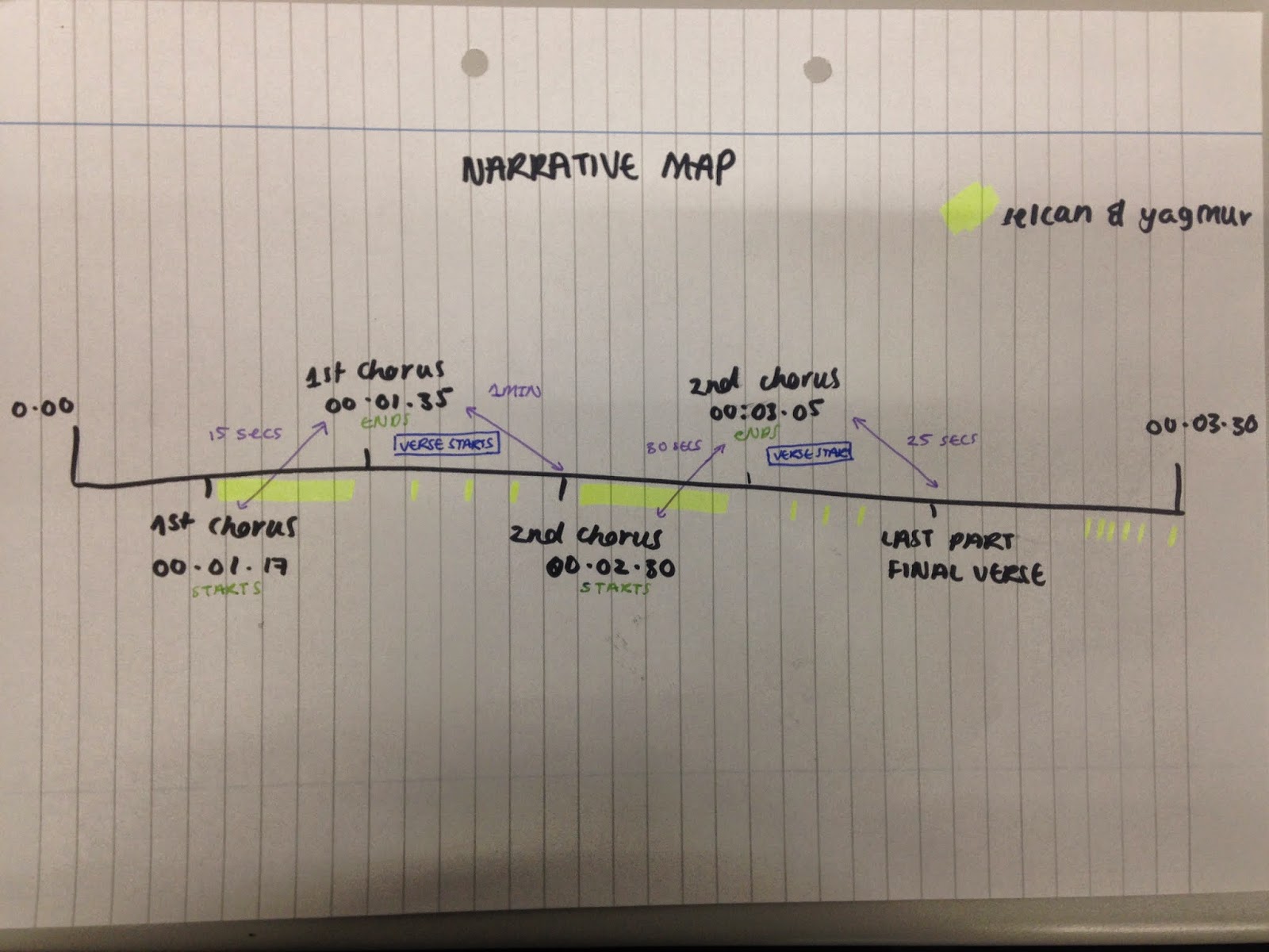
This is our narrative map, we created this in order to help us while making the music video, we went through the song, and marked the chorus and wrote down the time, so we know what shots to put during the chorus'.


- Every chorus we decided to have shots of Yagmur and Selcan as the music is upbeat and it is recurring, to represent the past memories.

- When the chorus ends the verse starts, this is the slower part of the song, it gives us more time to understand the protagonists loneliness and set a down atmosphere. We have the protagonist alone exploring, however we will have hints of past memories with Selcan throughout.

- The 'Last Part/Final Verse' is where we will have the shots of the graveyard where the protagonist goes to visit the friend at her gave, and leaves her valuable and symbolic book on the grave. The music is much faster towards the end, and we will have distorted shots of the past memories.

Monday 19 January 2015

Final cut Pro process - Safwana and Yagmur


Stage one: 
We began importing our footage onto Final Cut Pro, this allowed us to watch the footage in our organised folders and put them on our timeline in the order that we want. We started off dragging the footage from the desktop which became quiet difficult, as we had to go through all our footage and drag them individually onto the timeline, also it became crowded so we decided to start over again and import all the footage onto Final Cut pro. 

Stage two: 
We used our story board to order the footage, firstly we started off with the first section, which is a tilt of the protagonist looking out of the window. We cut the beginning which was too long, and started where we got the light flare. We also had to take into consideration the music, we planned to have some of our footage link with the lyrics, such as "we were young". Here we had a quick clip of the two friends taking a picture. 


Stage three:
The lyrics for this part of the song were "back in 1991", we decided to reverse the shot of Yagmur and Selcan jumping off a log. The reverse shot presents us with the past, all the joy that they once experience is now going, as the friend dies.


Stage four:
The lyrics for this part of the song were "when the story first begun". We decided to use a shot of pages which we sped up to represent time going by really quickly, especially as death is unexpected.


Stage five:
The lyrics for this part of the song is "I remember" and the pace of the song is slow so we decided to slow down the shot of the merry-go-round to fit the music. Additionally, it reflects childhood and past memories which goes well with our theme.


Stage six: 
Here we have two shots which are parallel to each other. The first shot is of the protagonist taking pictures alone and the second shot is of the two friends taking pictures together. The flash represents a 'flashback' which leads us to the past memories. 


Stage seven:
Here we have two shots that flow well together because the first shot pans up to the light, and the second shot transitions into light which then pans down to the protagonist. The light can be a representation of 'heaven' and the friend is looking up at her. 


Sunday 11 January 2015

Cd cover - Safwana

To create the CD cover I searched the CD Cover size specifications and these were the sizes for real music Cd's, 4.75 inches square. Real printed designs include bleed, the "bleed area" is an extra 1/8" of space for backgrounds to extend beyond the finished size of the CD. 


When creating the CD cover, I looked for inspiration from other music CD covers, and I wanted to in-cooperate tumblr images into the cover, I done this through the use of offset which allowed me to add a type of white screen above which is faded out, giving a less distinct image of the background, making it easier for the logo Haze to stand out. Also it follows the conventions of indie rock music.

Here are some of the CD Covers I have made


CD Cover inspiration - Safwana

Saturday 10 January 2015

CD covers Photoshop - Yagmur

I decided to make some basic CD covers on photoshop by taking inspiration from the different CD covers I liked. I used our logo for 'Haze' and simply put them on each image I edited. I used mainly black and white, but I also tried some more greyish/faded effects. My main inspiration was from the Vampire Weekend CD cover I found as they usually have their band name over a simple photo.


This is my first cover I designed and it's probably my least favourite. Mainly because of the fact that I couldn't get the logo to look good at any part of the image. I tried different colours for the font like black and white but it still didn't work. I don't think we'll be using this image for the cover.


These are the next ones I designed. I prefer these a lot more to the first cover as the blurry lights and the lights from the building compliment the logo really well. I prefer the second one as the white background with the image reflecting through the letters stand out much more, as the first one the text is faded out.


This is my favourite CD cover that I designed. I really like that the black and white has a grainy effect over it, the image is also quite blurred and has a low quality, making it look quite hazy. At first I only put the logo over the image, but then I wanted to see how it would look with the song name. I really liked how it turned out to be, so I decided to edit the back cover too. I got a shot of a candle that we filmed for our video, and I did the exact same effects. I used The Neighbourhood's CD back cover text for mine to see how it would look, and I think it compliments the front cover really well, especially because it actually has the 'alleyways' track listed so it's much more realistic. It fits well with our indie/rock genre.


Friday 9 January 2015

Inspiration from CD covers - Yagmur

I decided to do some quick research and I found some CD covers that I liked and that could be used as inspiration for my groups CD digipak and magazine advert.